


Quick Summary
Budgeting for custom eLearning development has become unexpectedly challenging for L&D leaders, HR teams, and training managers, especially across India and the USA. Costs fluctuate widely because modern eLearning is no longer built from templates; it’s built from scenario design, animation, accessibility engineering, SME inputs, and cloud workflows that look different for every organisation.
As companies move toward interactive, cloud-native learning ecosystems, they’re asking: What should custom eLearning really cost in 2026, and why do vendors quote such different numbers?
This guide answers that with research-backed pricing benchmarks, India vs USA comparisons, hidden costs teams often miss, and a clear framework for evaluating your true development investment.
If you’re trying to understand why custom eLearning pricing feels unpredictable? You’re not imagining it.
Across India and the USA, L&D leaders, IDs, procurement teams, and training owners are asking the same questions:
- “Why do two vendors quote completely different rates for the same project?”
- “What actually drives the cost of interactivity, animation, SME time, accessibility, and cloud workflows?”
- “How do we budget realistically without being surprised later?”
- “Where do India and the USA pricing differ and why?”
These questions arise from a deeper tension every ICP member feels:
Your stakeholders want measurable impact. Your budget wants predictability. Your learners want better experiences.
And that’s exactly where cost becomes confusing.
Why Pricing Has Become Harder, Not Easier
Traditional development workflows weren’t built for the speed, scale, or quality expectations of 2026. They relied on:
- scattered storyboards
- manual versioning
- slow review cycles
- inconsistent templates
- difficult LMS publishing
- Rework caused by misaligned SMEs
This made pricing unpredictable because the process itself was unpredictable.
Cloud-Native Development Changed Everything
Modern teams now use cloud authoring platforms, reusable design systems, automated publishing pipelines, accessibility-by-design templates, and real-time SME collaboration.
This has shifted eLearning from “designer + developer builds slides.”
To “a coordinated content operations workflow.”
And that evolution is exactly why costs vary.
Here’s the real truth:
Custom eLearning isn’t expensive because vendors charge differently.
It’s variable because the underlying work varies massively from project to project.
Before we break down real-world costs (India vs USA), interactivity-level pricing, hidden expenses, and timelines, we need to answer one foundational question:
What makes two “5-minute modules” cost completely different amounts?
That’s where true budgeting clarity begins.
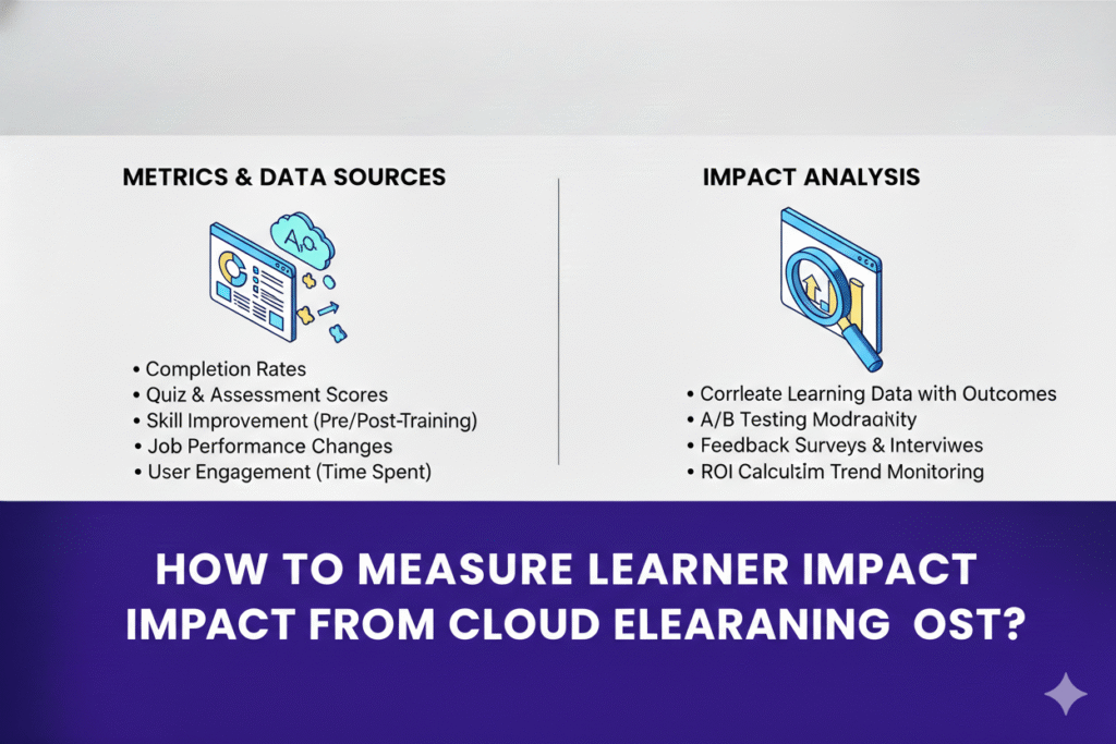
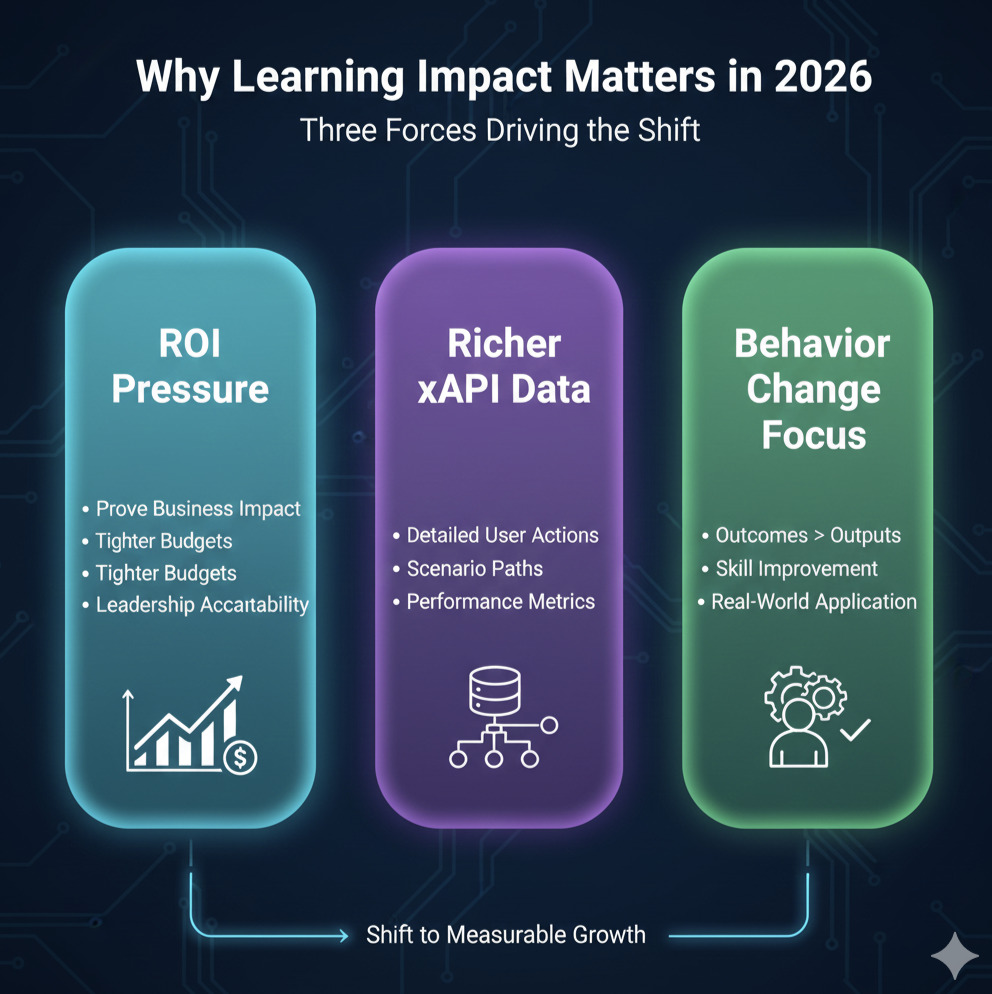
Why Measuring Learning Impact Matters Now
Cloud eLearning has transformed how organizations understand learner behavior, skill growth, and performance outcomes. Across India and the USA, L&D teams are no longer judged by how many courses they launch but by whether those courses create measurable improvement in skills, productivity, safety, sales, or customer outcomes.
The shift from traditional SCORM reports to cloud learning analytics has unlocked powerful new insights. With richer xAPI data, integrated HRIS signals, and cloud dashboards, organizations can finally see whether learning is actually working, not just whether it was completed.
Below are the three forces driving this industry-wide shift.
Pressure on L&D to Prove ROI in 2026
Budgets are tighter, business expectations are higher, and leadership teams want evidence, not assumptions. According to the LinkedIn Workplace Learning Report 2025, 82% of global L&D leaders say they are now required to demonstrate clear business impact, a steep rise from just two years ago.
This shift is especially strong in IT, BFSI, healthcare, manufacturing, and SaaS organizations operating across India and the USA. Decision-makers want to know:
- Did learning reduce errors?
- Did onboarding speed improve?
- Did customer interactions get better?
- Did sales conversations move forward?
In 2026, learning impact measurement is no longer a “nice-to-have.” It is a strategic requirement.
Cloud-based eLearning solutions and custom eLearning providers now focus heavily on analytics because ROI validation directly influences budget renewal, performance reviews, and long-term learning investment.
Cloud Systems Generating Richer xAPI + Event-Level Data
Modern cloud learning ecosystems generate far more data than traditional SCORM modules. Instead of simple “completed/not completed,” xAPI makes it possible to capture how learners interact with content:
- every click, attempt, and decision
- branching scenario paths
- simulation performance
- video engagement depth
- retry behavior
- time spent per activity
- accessibility interaction patterns
According to a 2025 Learning Guild Analytics Study, organizations using structured xAPI event tracking gain 3X more actionable insights than those relying only on LMS logs.
This deeper visibility allows teams to measure not just participation but learning quality, skill growth, and task readiness.
For enterprises investing in cloud-based eLearning software or custom eLearning solutions, richer analytics is now a competitive advantage, not a bonus.
Shift from “Course Completion Culture” → Measurable Behavior Change
The industry is moving away from tracking outputs (“Did they finish?”) toward tracking outcomes (“Did they improve?”).
Behavioral indicators now matter more than ever:
- reduced mistakes
- improved decision-making
- faster task execution
- better customer handling
- compliance consistency
- real-world skill application
This shift is fueled by cloud analytics dashboards that reveal how learning impacts workplace behavior.
In short: completion shows attendance; behavior shows impact.
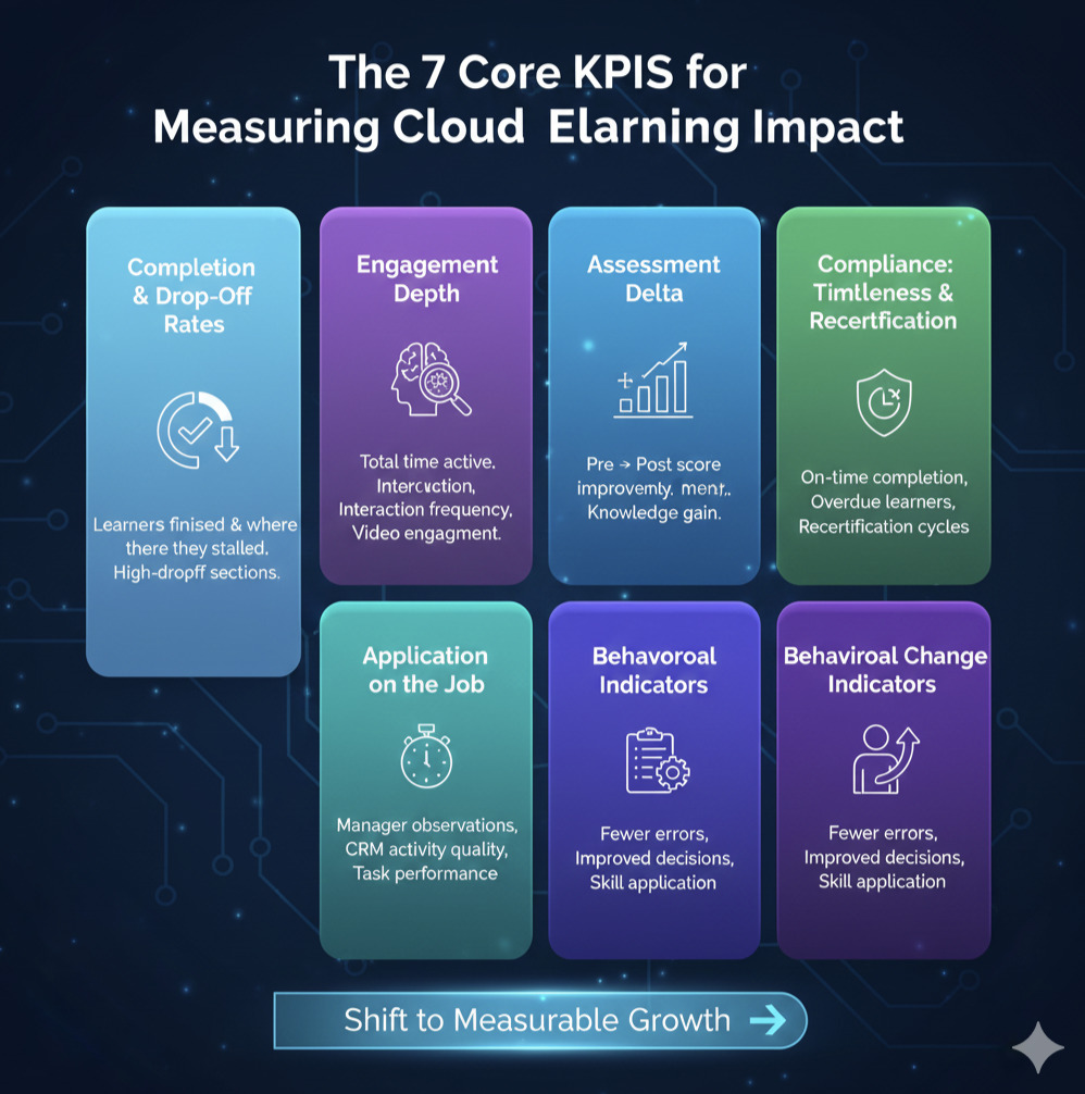
Essential KPIs for Cloud elearning Impact
If measuring impact is the why, KPIs are the how.
Cloud eLearning ecosystems, especially those powered by xAPI, LRS dashboards, and HRIS data, allow L&D teams across India and the USA to track learning in ways traditional LMS reporting could never support.
The right KPIs help teams answer questions like:
- Are learners actually engaging with the content?
- Are skills improving over time?
- Is behavior changing in real workplace scenarios?
- Is learning connected to business outcomes?
Below are the seven essential KPI categories every modern learning analytics dashboard should track, regardless of whether you’re using Power BI, Looker, Tableau, or a custom analytics solution.
1. Completion & Drop-Off Rates
Completion rates still matter, but only when paired with more meaningful indicators.
In cloud learning analytics dashboards, completion metrics reveal:
- How many learners finished the module
- How long did they take
- where they abandoned or stalled
- When mobile vs. desktop differences appear
- which sections trigger high drop-offs
For example, if 90% of learners drop off at the same slide, the issue isn’t the learner, it’s the design.
A 2025 ATD Learning Measurement Report found that drop-off analysis is one of the top predictors of learner friction in cloud-based e-learning software.
Completion metrics become truly actionable only when paired with engagement depth and behavior indicators.
2. Engagement Depth
Engagement depth tells you how learners interact with custom e-learning content, not just whether they opened it.
Cloud-based eLearning platforms and xAPI tracking capture:
- total time spent
- idle time vs. active time
- interaction frequency
- revisit patterns
- scroll depth in long-form content
- video play/pause/rewind behavior
Low engagement depth often indicates:
- cognitive overload
- unclear instructions
- too much text
- weak scenario relevance
According to Learning Guild Analytics 2025, courses with strong scenario relevance showed 2.4X higher engagement depth vs. information-heavy modules.
This KPI helps identify which content needs restructuring, not just updating.
3. Assessment Delta
Pre → post test improvement
Assessment delta measures learning gain, not just test scores.
Assessment Delta Formula: (Post-Test Score – Pre-Test Score) / Pre-Test Score × 100
This KPI helps determine:
- whether learners improved
- Which skills need reinforcement
- Which modules require redesign
- whether assessments measure real competency
When tracking learner impact cloud eLearning, the delta metric typically correlates with job performance improvements, especially in onboarding, compliance, sales, and product training.
A 2024 LinkedIn Learning Insights report found that teams using pre/post assessment tracking improved knowledge retention by 34% compared to teams relying on standalone quizzes.
4. Time-to-Proficiency
Time-to-proficiency is one of the strongest indicators of ROI because it connects learning with productivity.
It answers:
- How long does it take for a learner to reach baseline competency?
- Are new hires becoming productive faster?
- Which learning paths accelerate proficiency?
Time-to-proficiency signals are pulled from:
- assessment trends
- supervisor observations
- workflow tool performance
- simulation scores
- practice-task completion
Organizations using custom e-learning training solutions often track this metric to measure onboarding effectiveness.
A 2025 Training Industry Benchmark study showed that reducing time-to-proficiency by just 10% can deliver substantial cost savings and productivity gains, especially in sales, customer support, and operations-heavy roles.
5. Application on the Job
This KPI measures whether learners use the skills they’ve learned.
Job application data can come from:
- Manager observation checklists
- coaching feedback logs
- CRM activity quality (in sales)
- ticket resolution accuracy (in support)
- safety compliance adherence
- real-world task performance
This KPI is essential because cloud eLearning analytics alone cannot capture real-world performance without HRIS or operational system integration.
Organizations that combine LRS data with performance KPIs report significantly higher accuracy in measuring learner impact, according to Learning Guild’s Workplace Data Study 2025.
6. Behavioral Change Indicators
Behavior change is the ultimate goal of learning and often the hardest to measure.
Behavior indicators include:
- fewer repeated errors
- improved decision paths in simulations
- better customer interactions
- increased compliance consistency
- improved judgment in real-world tasks
These indicators require a blend of:
- simulation/training performance
- supervisor assessments
- operational system data
- pattern recognition from analytics dashboards
Behavior change analytics is where cloud-based e-learning software and xAPI-powered insights outperform traditional LMS reporting.
7. Compliance: Timeliness & Recertification
For compliance-heavy industries, BFSI, healthcare, pharma, and manufacturing, this KPI is non-negotiable.
Track:
- on-time completion
- overdue learners
- risk-score segments
- recertification cycles
- time between certifications
- retake patterns
Cloud eLearning KPIs often connect compliance metrics with HR systems, enabling automated nudges and manager alerts.
This allows organizations to proactively reduce compliance risk instead of reacting after an audit or incident.
Setting Up Learning Event Tracking (xAPI + Cloud Pipelines)
Before you can measure learner impact, you need the right data infrastructure to collect meaningful signals. Traditional SCORM is too shallow; it only tracks completions, scores, and time spent. To understand how learners engage, why they behave a certain way, and whether skills are improving, you need structured xAPI tracking supported by cloud analytics pipelines.
Across India and the USA, organizations adopting cloud-based e-learning software and custom e-learning solutions are moving toward standardized xAPI instrumentation because it provides event-level insights that fuel KPI dashboards, AI-based recommendations, and business impact measurement.
A 2025 Training Industry analytics report found that learning teams using structured xAPI tracking were 4.2X more likely to demonstrate measurable performance outcomes compared to SCORM-only teams.
Below is a practical framework for setting up learning event tracking written for L&D leaders, instructional designers, and platform engineering teams.
What to Instrument (Interactions, Branching Choices, Engagement Points)
Effective learning analytics begins with choosing the right events to track. You don’t need to track everything; you need to track what matters.
High-impact events include:
- decision points in branching scenarios
- video engagement (rewind, pause, completion %)
- assessment attempts + retry behavior
- time spent per slide, activity, or simulation step
- tooltips, hotspots, and interaction engagement
- application-focused actions (e.g., choices in customer simulations)
- accessibility interactions (keyboard navigation, alt-text reads)
A Learning Guild 2025 Data Study found that 70% of performance insights came from just 20–25 key events, meaning instrumentation should be strategic, not overwhelming.
As learning analytics expert Megan Torrance says:
“xAPI isn’t about collecting more data; it’s about collecting the right data to tell a meaningful learning story.”
This intentionality ensures dashboards reflect learner behavior, not noise.
xAPI Verb Taxonomy (Completed, Attempted, Answered, Progressed, Experienced)
To generate consistent, interpretable data, xAPI tracking must use a standardized verb taxonomy.
The most commonly used verbs include:
- Experienced learner viewed a screen or section
- completed a module, video, or scenario
- attempted to initiate an activity or quiz
- answered submitted a response
- progressed through the stages of a simulation
- selected/chose decision-making in branching scenarios
- interacted and engaged with an interactive component
Using structured verbs ensures learning dashboards remain clean and comparable across tools and modules, even when working with multiple custom e-learning companies or internal development teams.
The xAPI Profile Registry (ADL Initiative) emphasizes that consistent verbs reduce analytic ambiguity by up to 60%.
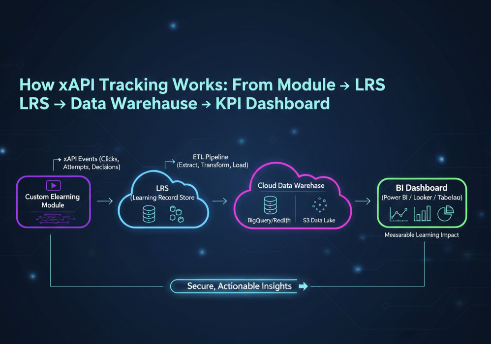
Understanding xAPI (Experience API) is crucial for transitioning from simple completion tracking to deep learning analytics. Watch this short video to see the core components of an xAPI system, from how the learning activity generates a statement (“Learner [Verb] [Activity]”) to how that data flows into an LRS and ultimately to your analytics dashboard. This visualization helps clarify why xAPI serves as the foundation for measuring learning impact.
Cloud Data Warehousing: S3 / BigQuery / Redshift + ETL Pipelines
Once xAPI statements are generated, they must be routed to a cloud data warehouse via an LRS (Learning Record Store).
Typical architectures include:
- Amazon S3 + Redshift → common for large enterprises
- Google Cloud Storage + BigQuery → preferred for AI/ML analytics
- Azure Data Lake + Synapse Analytics → for Microsoft-centric ecosystems
ETL (Extract, Transform, Load) pipelines normalize the data so dashboards can read it cleanly.
Cloud warehousing makes it possible to:
- Merge LMS, HRIS, xAPI, and performance data
- Process millions of learning events
- Run automated daily/weekly refreshes
- Create unified KPI dashboards
According to AWS EdTech Trends 2025, organizations that move to cloud learning data lakes see a 2.7X increase in analytics adoption because reporting becomes automated, not manual.
How to Ensure Privacy, Consent & Secure Storage
With richer learner tracking comes greater responsibility.
Learning data must meet regional privacy requirements across India, the USA, and global teams.
Key guardrails include:
- hashing or pseudonymizing personal identifiers
- encryption at rest and in transit
- consent prompts when collecting behavioral data
- role-based access control (RBAC) for dashboards
- storing only the necessary xAPI attributes
- audit trails for data access and updates
As Donna Boyer, Chief Product Officer at Skillsoft, notes:
“Learner data is incredibly powerful, and that power comes with an equal need for transparency and trust.”
Secure analytics pipelines ensure learning insights strengthen performance without compromising privacy or compliance.
Building an Effective KPI Dashboard (Templates Included)
A KPI dashboard is the central place where learning insights become business decisions. For many L&D teams across India and the USA, the challenge isn’t collecting data; it’s making that data meaningful. A well-designed dashboard transforms raw xAPI events, HRIS metrics, and LMS logs into actionable insights that help leaders understand not just what learners did, but what improved.
According to the LinkedIn Workplace Learning Report 2025, 74% of L&D leaders say they need better analytics to influence business strategy, yet fewer than 30% have dashboards that connect learning behavior with skill development or productivity. This gap exists not because of a lack of data, but because dashboards often prioritize decoration over decision-making.
A high-impact learning dashboard must be:
- clear and intuitive
- role-specific
- tied to business KPIs
- automated, not manually updated
- built on standardized xAPI and LMS signals
As visualization expert Cole Nussbaumer Knaflic emphasizes:
“Data isn’t useful until it informs action. Dashboards are only valuable when they make the next step obvious.”
Below are the core components of an effective, cloud-powered learning analytics dashboard.
Visualization Essentials: Funnels, Heatmaps, Progress Curves
Great dashboards show patterns, not just numbers. The visuals should guide stakeholders to the insight without requiring technical interpretation.
Essential visualizations include:
Completion Funnels
Show where learners drop off (module start → mid → finish). Ideal for diagnosing friction.
Engagement Heatmaps
Reveal which screens learners linger on, skip, or revisit. Especially useful for scenario-based learning.
Progress Curves
Map skill growth over time using assessment delta or proficiency scores.
Behavior Trend Lines
Track decisions made in branching scenarios, error types, and simulation performance.
Research from MIT Sloan (2025) found that teams using visualized behavior data resolved content issues 45% faster than teams using numeric tables alone.
The goal: insights at a glance, not hours of interpretation.
KPI Groupings: Engagement, Proficiency, Compliance, Business Outcomes
Dashboards work best when KPIs are grouped into themes that reflect learning goals. Recommended KPI categories include:
Engagement KPIs
- completion rates
- drop-off points
- time spent
- interaction depth
- video watch-through percentage
Proficiency KPIs
- pre vs post assessment improvement
- scenario performance scores
- simulation accuracy
- time-to-proficiency curves
Compliance KPIs
- on-time completion
- certification tracking
- re-certification cycles
- overdue modules
Business Outcome KPIs
- reduced error frequency
- sales pipeline progression
- customer satisfaction changes
- productivity/time-saving metrics
This grouping ensures that dashboards resonate not only with L&D but also with HR, operations, and leadership stakeholders.
Compare Dashboard Tools: Power BI, Looker, Tableau, Custom Dashboards
Each dashboard tool has strengths depending on budget, infrastructure, and engineering capability.
Power BI
- Most cost-effective
- Strong for teams using Microsoft ecosystems
- Excellent for automated refreshes
- Popular across India-based enterprises
Looker (Google Cloud)
- Best for BigQuery pipelines
- Strong semantic modeling
- Ideal for AI-driven insights and embedded dashboards
Tableau
- Industry-leading visualization polish
- Best for executive dashboards
- Preferred by USA-based enterprise teams
Custom Dashboards (React, Angular, Python)
- Maximum flexibility
- Ideal for integrating LMS + HRIS + LRS data
- Tailored UX for specific learning operations
Most custom e-learning providers and platform engineering teams recommend choosing the tool that aligns with existing data infrastructure, not just visual preference.
How to Set Thresholds + Alerts for Low-Performing Modules
Dashboards become powerful when they include automated triggers, not just passive metrics.
Examples:
- Alert when drop-off > 30% on any module section
- Flag assessments where average scores fall below 70%
- Notify managers when compliance deadlines are missed
- Highlight modules with high “revisit” frequency (indicating confusion)
- Spot engagement dips after new content releases
These thresholds allow L&D and operations teams to intervene early, update content, support struggling learners, and reduce performance risk.
As analysts often say, “The best dashboards don’t wait, they notify.”
How to Interpret Learning Data (Insights → Action)
Collecting learning data is easy. Interpreting it in a way that drives performance improvement is where most L&D teams struggle, especially across large, distributed workforces in India and the USA. Dashboards often show what happened, but not why it happened or what to do next.
According to the ATD Learning Analytics Report 2025, only 38% of organizations feel confident interpreting learning data, even though most have access to LMS logs, HRIS signals, and xAPI feeds. This gap exists because dashboards frequently surface metrics without context, narrative, or actionable insight.
True impact happens only when L&D teams move from numbers → patterns → decisions.
Below are the three critical interpretation skills every modern L&D team must master.
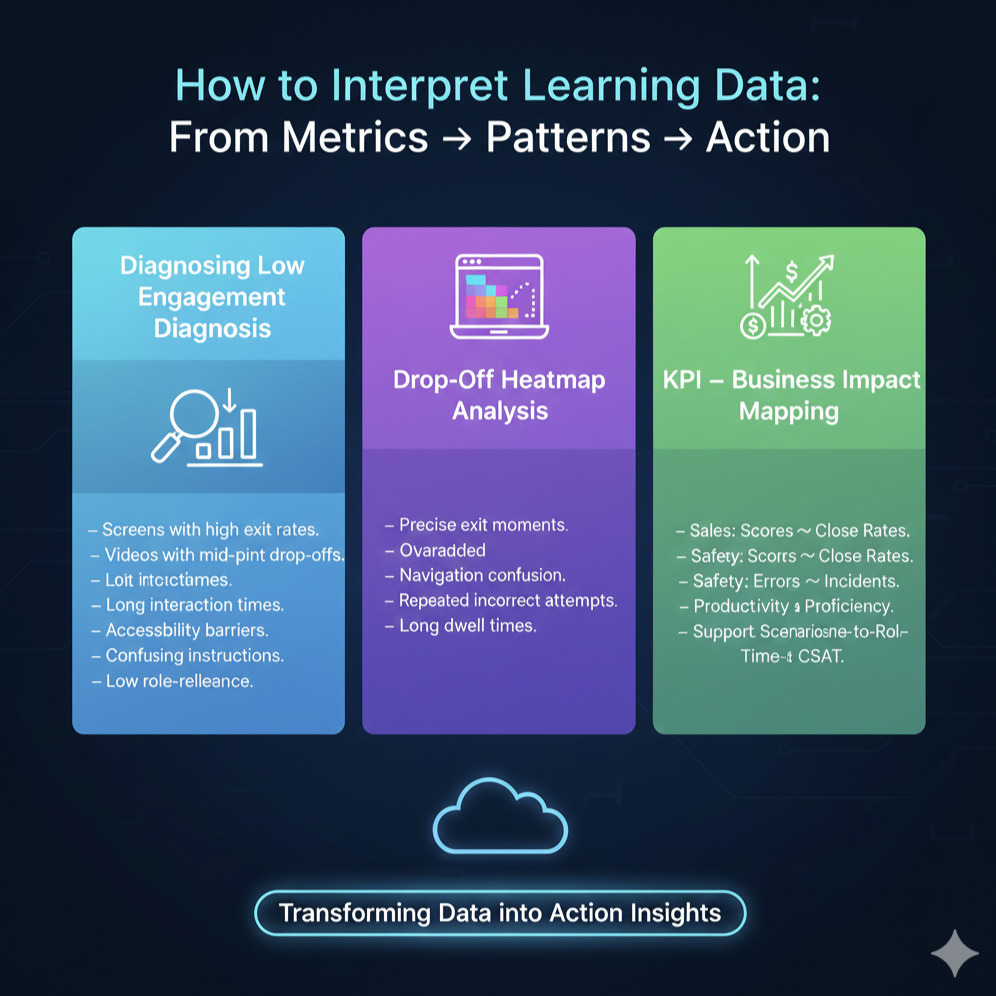
Diagnosing Low Completion or Engagement
Low completion rates or engagement drops rarely mean learners “don’t want to learn.” They usually indicate friction points that your dashboard can reveal:
- Screens with unusually high exit rates
- Videos with steep mid-point drop-offs
- Interactions that take too long to complete
- Accessibility barriers (keyboard traps, small text, low contrast)
- Confusing instructions or non-intuitive UI
- Modules that don’t feel relevant to the learner’s role
For example, xAPI heatmaps may reveal that 25% of learners exit immediately after a complex branching question, signaling unclear instructions.
The key is to interpret low engagement not as learner failure, but as a design opportunity, an insight-driven clue about where the learning experience needs refinement.
Finding Content Friction Points (Drop-Off Analysis)
Drop-off analysis shows exactly where learners disengage, hesitate, struggle, or repeat actions. With cloud-based e-learning software and event-level xAPI data, teams can trace:
- the precise moment learners leave a module
- which interaction creates cognitive overload
- where navigation becomes confusing
- which scenario decisions trigger retries
- how long learners pause before responding
A 2025 Learning Guild analytics study found that teams using structured drop-off analysis reduced content friction by 31% within the first two revision cycles.
Patterns to look for:
- sudden attention dips
- repeated incorrect attempts
- long dwell times on a single slide
- skipped resources
These insights reveal not just performance gaps but design flaws, unclear instructions, or mismatched difficulty levels.
Linking Learning to Business Impact (Sales, Safety, Productivity)
The ultimate purpose of learning analytics is to connect learning behaviors to business outcomes. This is where dashboards become strategic tools for leadership.
Examples of learning → business correlations:
- Sales Training: Higher assessment scores correlate with higher close rates or better pipeline progression.
- Safety Training: Fewer critical errors or incident reports after simulation-based modules.
- Productivity: Reduced time-to-proficiency for new hires after improved onboarding journeys.
- Customer Support: Higher scenario performance linked to improved CSAT or lower escalation rates.
When L&D aligns learning KPIs with real-world performance indicators, it becomes a revenue enabler, not a cost center.
This is why advanced custom e-learning solutions now include xAPI tracking that integrates directly with CRM, HRIS, or operational systems, making outcome measurement visible and credible.
Common Mistakes in Learning Impact Measurement
Even with the best cloud-based e-learning software, xAPI tracking, and KPI dashboards, many L&D teams struggle to get meaningful insights from their data. The problem is rarely the tools it’s the approach. Across India and the USA, organizations unintentionally follow outdated measurement habits that limit their ability to demonstrate impact.
Industry research from ATD (2025) shows that 54% of L&D teams still rely primarily on completions and smile sheets, even though leadership expects clear indicators of proficiency, productivity, and behavior change. These gaps create misalignment between what dashboards show and what business stakeholders want to see.
Here are the most common mistakes and how to avoid them.
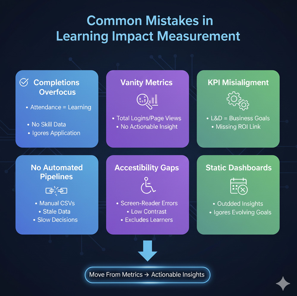
Mistake 1: Overemphasis on Completions (Instead of Performance Outcomes)
Completion rates reveal attendance, not learning.
A learner completing a course doesn’t tell you:
- whether they understood the content
- whether they can apply skills on the job
- whether behaviors improved
- whether business performance increased
In cloud eLearning, impact must be measured through skill proficiency, application, and improvement, not just module completion.
This is why modern dashboards map completions → assessment delta → performance KPIs to show real progress.
Mistake 2: Measuring Vanity Metrics Instead of Outcomes
Vanity metrics look impressive, but don’t influence decisions:
- total logins
- page views
- number of modules uploaded
- time spent without context
Without actionable interpretation, these numbers create noise, not insight.
Effective custom e-learning providers focus on outcome metrics such as:
- time-to-proficiency
- behavior adoption rates
- scenario accuracy gains
- reduction in mistakes or rework
Outcome metrics drive business conversations; vanity metrics do not.
Mistake 3: Not Aligning Learning KPIs With Business KPIs
A dashboard is only useful if it answers leadership’s question:
“How does learning improve business performance?”
Misalignment happens when:
- Sales KPIs aren’t linked to sales enablement modules
- Safety incident data isn’t mapped to compliance training
- Customer experience metrics aren’t tied to support training
- Productivity KPIs aren’t tied to onboarding journeys
When L&D and business leaders define success together, dashboards become strategic tools rather than reporting obligations.
Mistake 4: No Automated Data Pipelines → Manual Reporting Bottlenecks
Many organizations still export CSV files every month and manually combine data from:
- LMS
- LRS
- HRIS
- Performance systems
- Survey tools
This creates delays, errors, and stale dashboards.
A 2025 Learning Guild study found that manual reporting reduces data accuracy by 28–35% and causes multi-week lags in decision-making.
Cloud data pipelines (S3, Redshift, BigQuery, automated ETL) ensure:
- real-time updates
- consistent data governance
- fewer errors
- a single source of truth
This is essential for scalable learning analytics operations.
Mistake 5: Ignoring Accessibility & Inclusion Data
Accessibility analytics are often missing, even though they directly influence learning outcomes.
Issues like:
- screen-reader errors
- keyboard traps
- low contrast
- missing captions
- complex interactions
All impact learning, equity, and performance.
Teams using accessible e-learning solutions consistently see higher completion and engagement rates because the experience works for everyone.
Accessibility data is not optional; it’s part of measuring true learner impact.
Mistake 6: Treating Dashboards as One-Time Deliverables
Dashboards must evolve as:
- new skills are introduced
- business goals shift
- product lines change
- compliance cycles refresh
- teams expand across India, the USA, APAC, and EMEA
Static dashboards lead to outdated insights.
High-performing L&D teams revisit KPI frameworks quarterly, ensuring alignment with current business priorities.
Dashboards are not artifacts; they’re living systems.
Next Steps:
Now that you have a clear framework for measuring learner impact with cloud analytics, the next step is to see how these KPIs, dashboards, and xAPI workflows could work inside your learning ecosystem.
Most L&D teams across India and the USA struggle not because they lack data but because they lack a practical measurement strategy. A short strategy discussion or a real dashboard walkthrough usually creates the clarity they’ve been missing.
Book a Demo or Strategy Discussion
If you want to understand:
- Which KPIs matter most for your onboarding, sales, compliance, or customer training programs
- How to design an xAPI-ready measurement model
- What a cloud learning analytics dashboard looks like in practice
- How to streamline analytics setup without changing your LMS
Then, a 15–30 minute strategy discussion is the fastest way to move forward.
Request a Demo or Analytics Strategy Call → We’ll walk you through a realistic measurement model tailored to your learning goals, vendor-neutral, practical, and immediately actionable.
FAQ:
- What KPIs matter most for cloud eLearning?
The most essential KPIs depend on your learning goals, but across India and the USA, organizations typically track: completion rates, drop-off points, engagement depth, assessment delta, time-to-proficiency, behavior change indicators, and compliance timeliness.
What matters is not the volume of metrics but how well they map to business outcomes like productivity, sales performance, safety, or customer satisfaction.
2. How do you calculate time-to-proficiency?
Time-to-proficiency measures how long it takes a learner to reach a defined performance benchmark.
A simple formula is:
(Date skill demonstrated at required level) – (Training start date)
Cloud learning analytics dashboards make this easier by combining LMS/LXP data, xAPI activity logs, and HRIS performance indicators to show each learner’s progression curve.
3. Can xAPI be added to existing SCORM courses?
Yes, many organizations retrofit xAPI tracking into SCORM content using wrappers, event listeners, or partial rebuilds. While older modules may require structural updates, most modern SCORM packages can be enhanced to capture richer KPIs without a full redevelopment.
4. How often should dashboards be updated?
For active training programs, dashboards should refresh daily or weekly, depending on the volume of learners. Leadership dashboards may update monthly to highlight trends, bottlenecks, and performance impact.
5. How do I prove ROI to leadership using learning analytics?
ROI becomes clear when learning KPIs connect directly to business KPIs.
For example:
• Higher proficiency → faster onboarding time
• Better compliance data → fewer errors or violations
• Improved scenario performance → better sales or customer outcomes
A well-designed learning analytics dashboard makes these relationships visible, quantifiable, and easy to communicate.